Fibro beach shacks hold a special place in the hearts of many Australians.
Humble in both their construction and styling, these homes are nostalgic reminders of a simpler time, built in the 1950s, ’60s and ’70s. But the downside of a classic beach shack is that they were designed primarily as pared-back weekenders, which means making one a liveable residence today is a tricky task.
Still, when a Melbourne family of four moved down to Ocean Grove and saw this leaky 1960s house come up for sale, they were determined to transform the property, with a sustainable makeover. It was especially important to them given one of the owners, Peter, is a director for electrification at retrofitting specialists Goodbye Gas.
Pete and his wife Sarah engaged Wiesebrock Architecture to transform the original fibro shack and design a new iteration of the poorly built studio at the rear.
‘While the owners loved the character of the house, the lack of insulation, energy efficiency and the impractical layout were all things they knew they wanted to change,’ Wiesebrock Architecture director Richard Wiesebrock says.
‘They wanted a cosy, functional family home that balances style and sustainability.’
The existing house was peeled back to its timber structure and fully insulated, wrapped, and a high-performance version of the facade was installed. Everything from the external cladding to the windows needed to be replaced too, and Richard was careful to ensure his selections channelled the same look as the original structure.
Existing vertical joint panelling was replaced with pastel blue fibre cement cladding for longevity, topped with Zincalume roofing and guttering. Most of the frame was retained or slightly modified to suit the new floorplan, with the 97-square-metre floorplan extended to 103 square metres, finding space for a new bathroom.
They also constructed a new 30-square-metre studio containing an office, extra living space, and storage, all within the compact footprint.
‘The new extension and studio building share the same design language, complimenting the original,’ Richard adds.
The biggest changes came in the introduction of several ‘green upgrades’, like timber double-glazed windows, extensive insulation, a rainwater tank and solar panels — generating more than 90 per cent of the energy the property consumes on an average day.
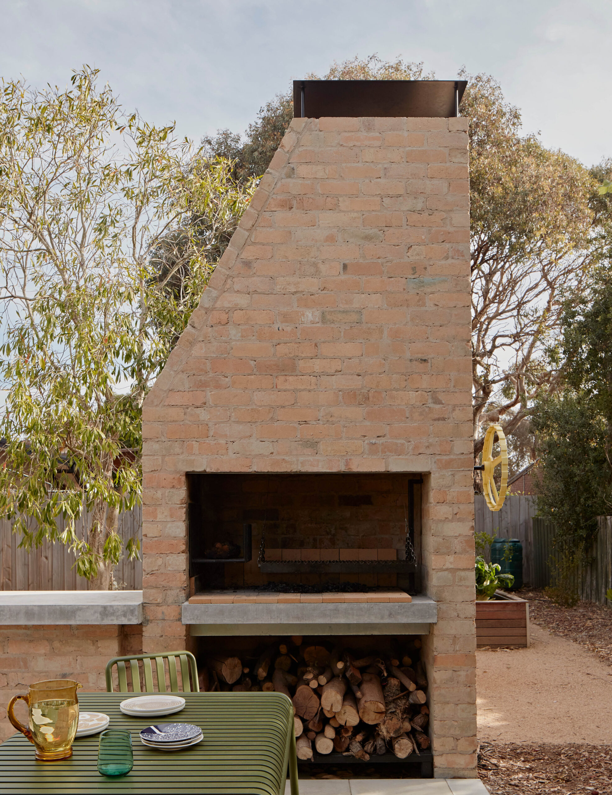
Richard says the kitchen was designed as the heart of the home, linking both the backyard and outdoor dining area, complete with a custom South American barbecue called a parrilla.
‘While at first glance the house doesn’t look wildly different to the original, the entire layout of the house and site has been transformed,’ Richard adds.
‘The house has been subtly lifted into the 21st century and is incredibly efficient. Most of all the house reflects the owners’ values and how they operate in the world; subtly, tactfully and meaningfully.’

