Altus Design Studio founder Josie Simpson starts every new project with a few keywords that help form her vision for the space.
For the clients of this renovated 1876 Balmain cottage, the words were: ‘textural, playful, creative and colour-filled’.
The design process started with an image Josie had seen online of a pink bench seat beside a timber table with striped legs, with quirky artwork hung on the wall behind. She felt it summed up the look the clients were going for, and they all agreed the ‘eclectic feeling’ of the space was ‘spot on’.
‘My clients are colour lovers, and this was evident in their home before I started the design process,’ Josie adds. ‘However, it was really limited to their art and objects as opposed to furniture and finishes, so I stepped it up a level and they loved it!’
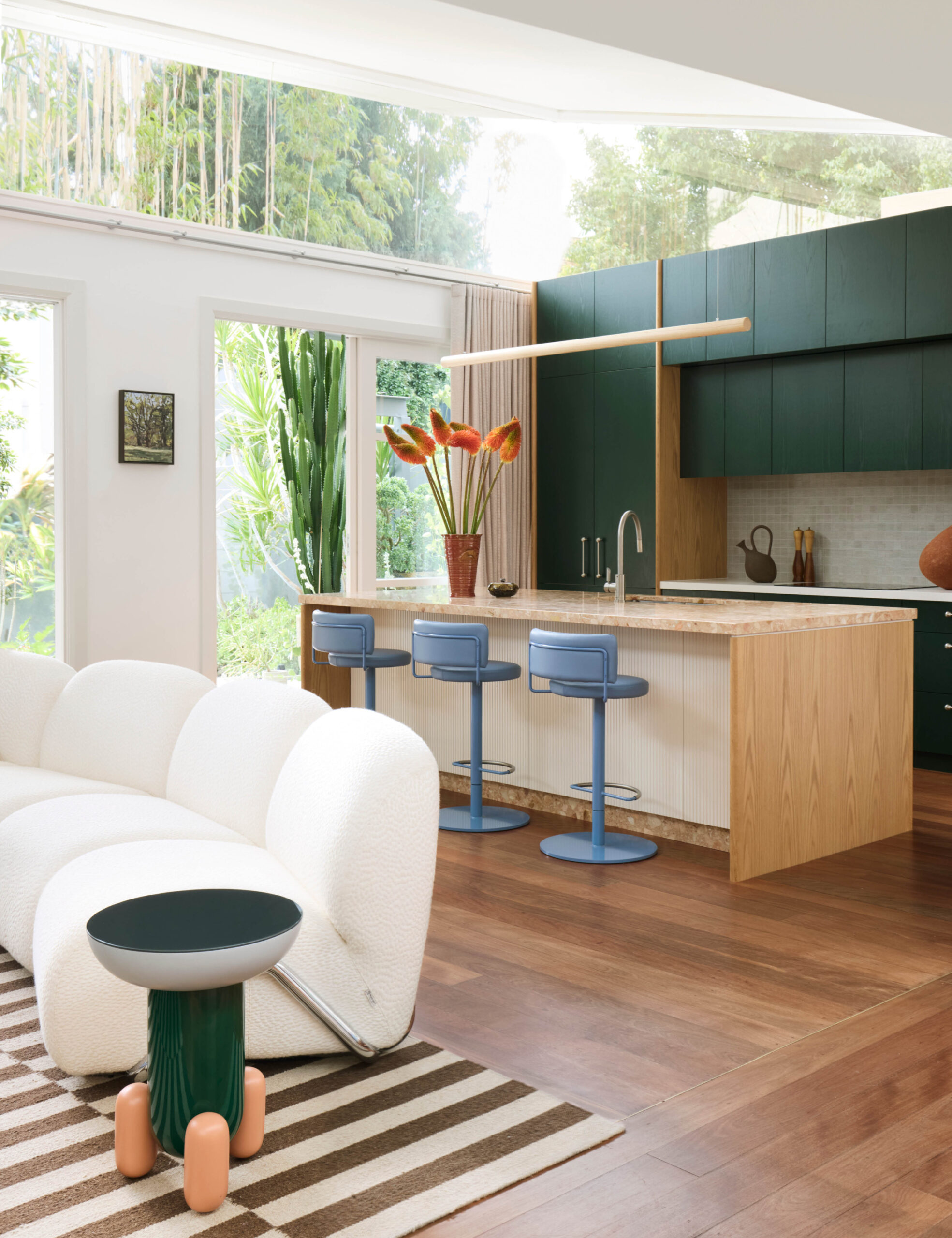
Just like in the inspiration image, Josie designed a striped banquette seat in two-tone pink leather in one corner of the living area, with deep-forest green joinery in the kitchen nearby.
‘We didn’t want the house to be an ode to green, so I consciously contrasted the green and coral terrazzo island bench in the kitchen with blue stools, which then gave license for the blue pendant over the dining area,’ she explains.
This harmonious approach to embracing colour set the tone for the rest of the interiors. Pale blue joinery creates a playful storage the refreshed living room, while a deeper midnight blue was used in the study’s five-metre-high joinery wall — giving the owner a dedicated a library for his extensive record collection.
It helped that the clients also had a ‘very open brief’, allowing Josie to make recommendations that could solve some of the ‘inefficiencies’ the family had noticed after living in the home for 12 years.
‘The rear living area was so large and wide that it wasn’t really being utilised,’ Josie says. ‘By incorporating the kitchen into the existing rear living space, we created a second lounge room where the kitchen used to be located — which is game changing for a family with kids about to embark on teenage years!’
Upstairs, the redesign took a few metres off one of the two bedrooms to make way for a new bathroom to service the second floor. ‘There was lot of space behind the existing walls in the raked ceilings, so we pushed all joinery including desks, shelves, and robes into this space so the room itself didn’t need to accommodate as much furniture,’ Josie adds.
‘When I stand back and reflect that we haven’t added any square metres to the home, yet we added a second living room, bathroom, more usable space in the girls’ bedrooms and a fully functional study, record storage room… It’s incredible.’
‘All of the spaces flow much better, and it is still a spacious home. Considered spatial planning can bring amazing results.’

